
Analysing Employee Survey Results
Learning Pathway:
AI 201: Domain Specific Tasks
17 June 2026
Learn how to let AI surface the patterns and anomalies from survey data.
Why this matters
Your engagement survey just closed and the insights you need are buried somewhere in the rows and rows of data. AI changes the equation. This guide shows you how to let AI do the heavy lifting, and how to apply the human judgment that turns a finding into action.
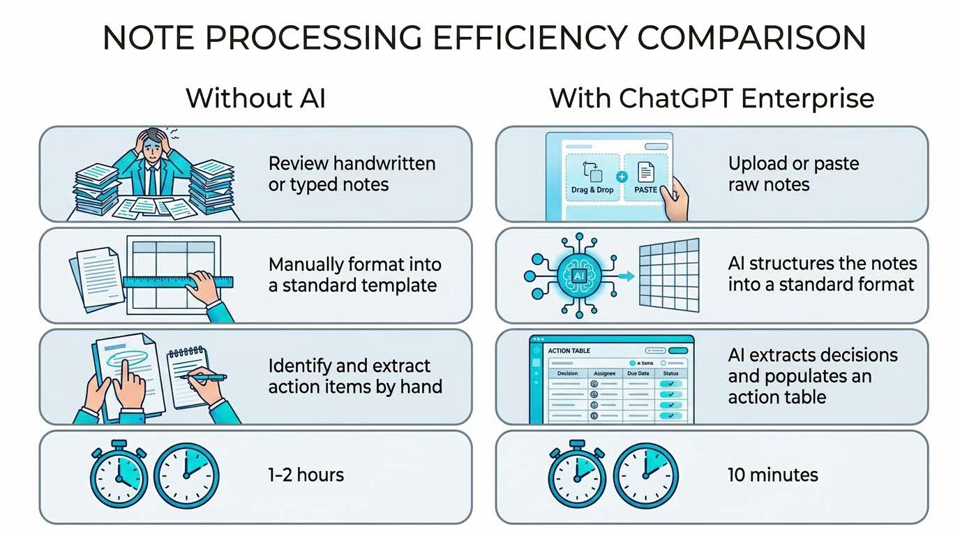
Your five-part recipe - C.R.A.F.T.
Use this structure to guide your thinking. Every effective AI task is built around five components — together, they spell CRAFT:
C.R.A.F.T.
C | 📂 Context | Staff Engagement Dataset and purpose of this survey |
R | 🎭Role (who the AI should act as) | A Data Analyst hunting for patterns and anomalies |
A | ⚡Action (what the AI needs to do) | Surface correlations, outliers and patterns from data. |
F | 📋Format | Summary table → Surfaced patterns → Chart → Three plain-English findings. |
T | 🔍Test | Validate the numbers and probe the conclusions drawn before finalising the output. |
Here’s what you need for this exercise:
Tools and Input required
🛠️ Tool | ChatGPT Enterprise (WOG) |
🔗 Feature | File Upload |
📂 Your input | Staff engagement survey results (*.csv or *.xlsx) |
Note: You can use any survey dataset. If you don't have one handy, use the fictional dataset below.
Fictional Data Set
Respondent_ID,Division,Seniority,Workload,Leadership,Tools,LD,Wellbeing
R001,Policy,Mid,4,4,3,4,4
R002,Policy,Senior,4,4,3,4,4
R003,Policy,Junior,4,5,4,3,4
R004,Policy,Mid,3,4,3,4,4
R005,Policy,Senior,4,4,3,4,4
R006,Policy,Junior,4,4,3,3,3
R007,Policy,Mid,3,4,4,4,4
R008,Policy,Senior,4,4,3,4,4
R009,Operations,Junior,2,3,2,3,2
R010,Operations,Mid,3,4,3,4,3
R011,Operations,Senior,3,4,2,3,2
R012,Operations,Junior,2,3,3,4,3
R013,Operations,Mid,3,4,3,3,3
R014,Operations,Senior,4,3,2,3,4
R015,Operations,Junior,2,4,3,4,2
R016,Operations,Mid,3,3,3,3,3
R017,Operations,Junior,4,4,3,4,3
R018,Corporate_Services,Junior,3,4,3,1,4
R019,Corporate_Services,Junior,4,4,4,2,4
R020,Corporate_Services,Junior,3,4,4,2,3
R021,Corporate_Services,Junior,4,3,3,3,4
R022,Corporate_Services,Mid,3,4,4,3,4
R023,Corporate_Services,Senior,4,4,3,3,3
R024,Corporate_Services,Senior,4,4,4,4,4
R025,Communications,Mid,3,4,4,3,4
R026,Communications,Senior,4,4,4,3,3
R027,Communications,Junior,3,5,4,3,4
R028,Communications,Mid,4,4,3,3,3
R029,Communications,Senior,3,4,4,4,4
R030,Communications,Junior,3,4,4,3,4
(Higher score = more satisfied.)
Step-by-step guide
Step 1: Gather your data. Your dataset could be a CSV file, Excel file or even a text file.
Step 2: Open ChatGPT Enterprise. Start a new chat in your WOG workspace.
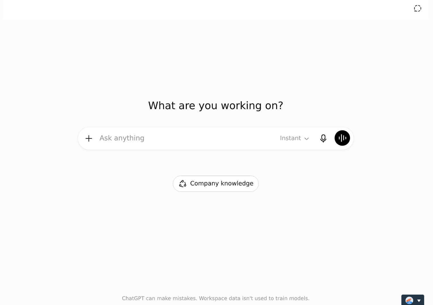
Open a new chat
Step 3: Tell ChatGPT what it's looking at and the question you need answered. If you just upload and say "analyse this", you'll get something generic. This prompt works whether you upload the file or paste the rows in directly:
Use this sample prompt
Here are our staff engagement survey results. Survey details:
Respondents across 4 divisions: Policy, Operations, Corporate Services, Communications
Each row is one respondent
Columns: Respondent_ID, Division, Seniority (Junior/Mid/Senior), Workload (1-5), Leadership (1-5), Tools (1-5), LD (1-5), Wellbeing (1-5)
Higher scores = more satisfied
Question: Which division has the lowest scores overall, and are any specific dimensions particularly concerning across the whole dataset? Show me the average score per dimension per division in a summary table.
[If pasting rather than attaching, add the rows of data here.]
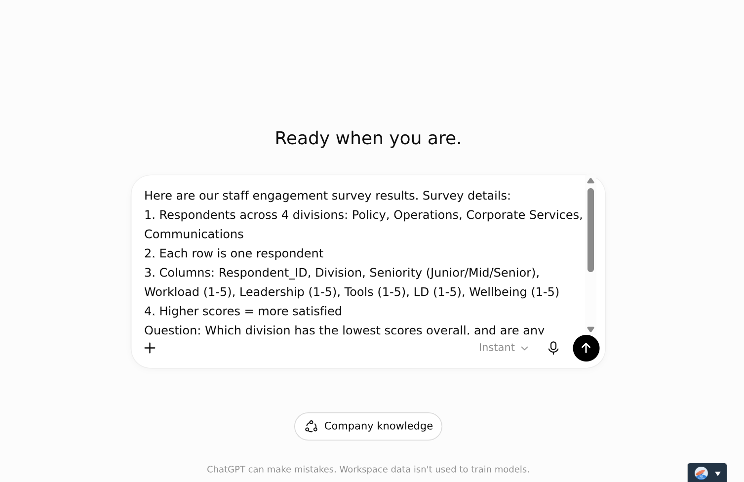
Enter the sample prompt
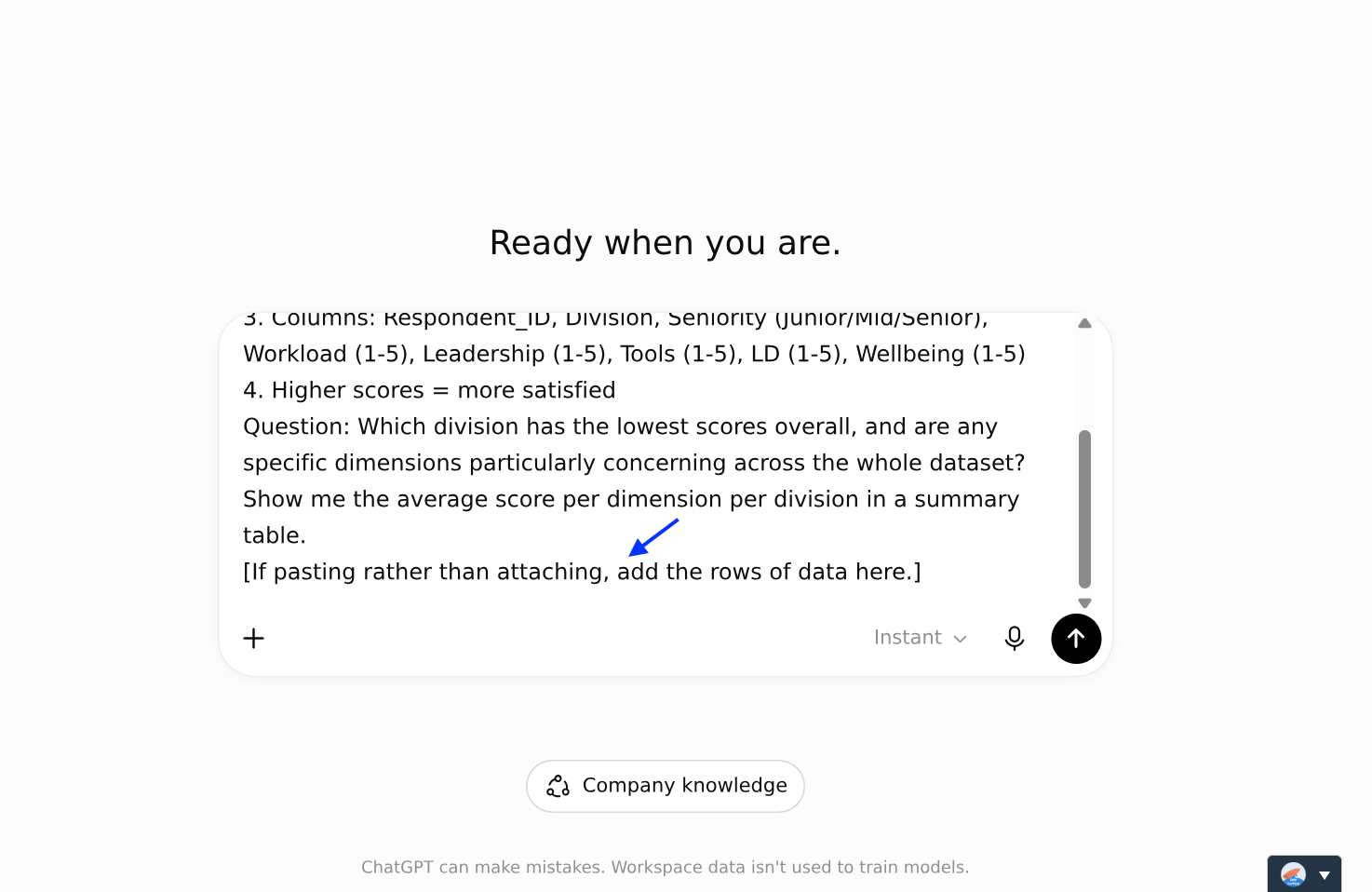
You can also paste your data directly into the chat
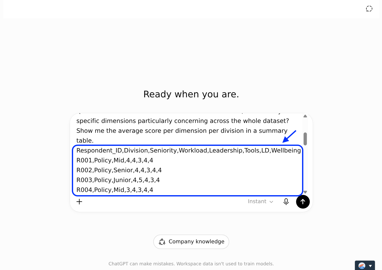
Sample data added
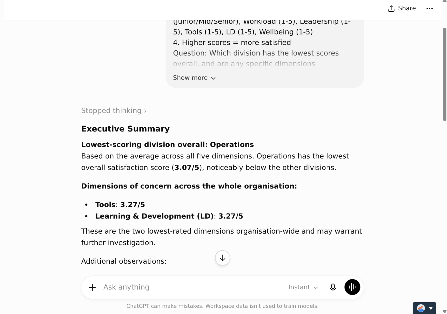
Send prompt and data
Step 4: This is where your value is. Push for the non-obvious:
Use this sample prompt
What is surprising or counterintuitive in this data? What would not be obvious from a quick read-through?
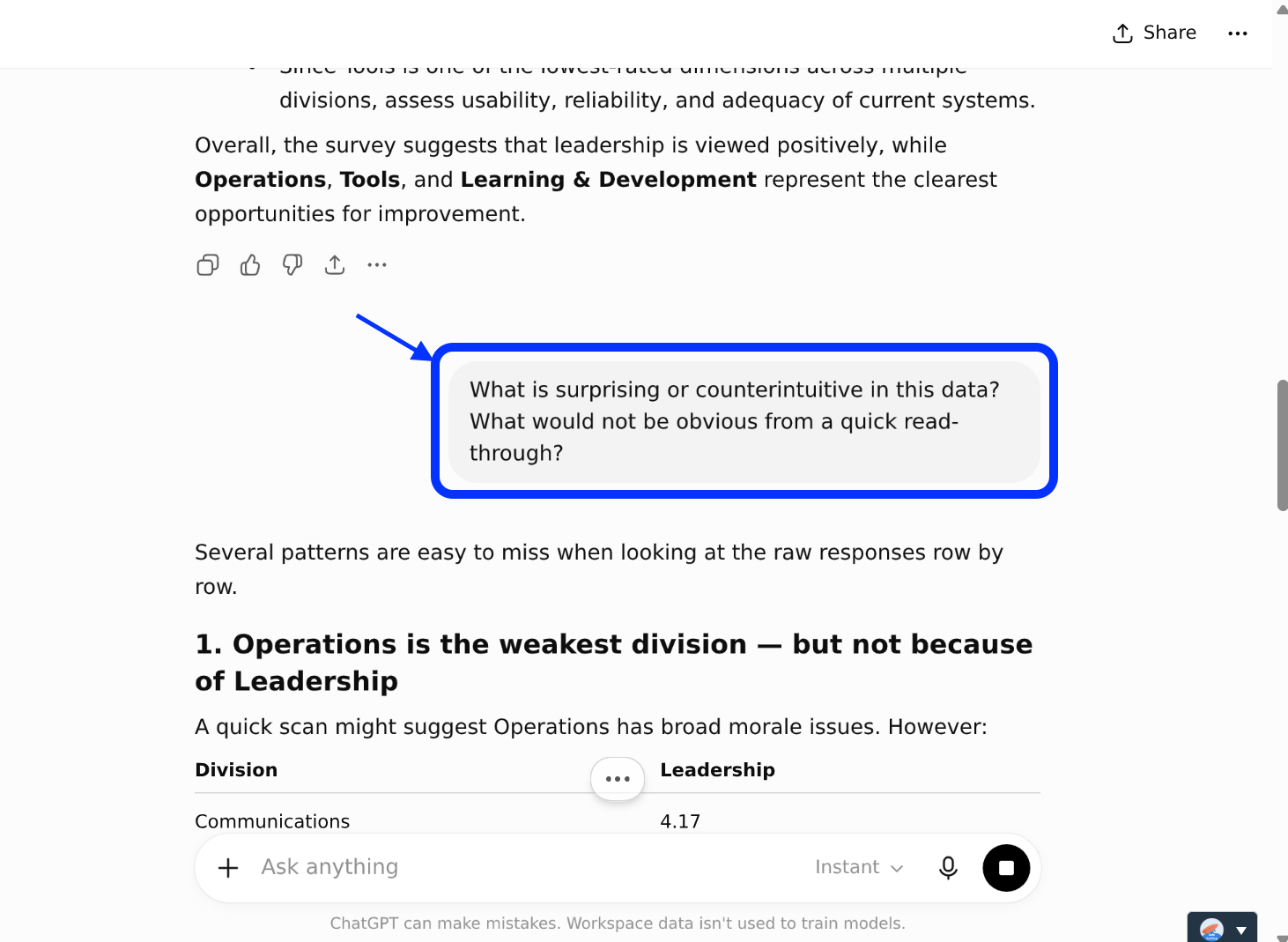
Enter the next prompt
With the sample data, expect non-obvious patterns like these:
Corporate Services' L&D score (2.57) is the single lowest in the whole dataset. A hidden issue sitting behind the obvious "Operations is struggling" story.
Leadership is the strongest dimension overall (3.90), the opposite of many engagement surveys.
You may also see secondary surprises. For example, Policy has a low Tools score (~3.3) yet the highest Wellbeing (~3.9).
Exactly which surprise the AI leads with will vary from run to run, and that's the point: AI surfaces the candidates; you judge which ones matter.
Step 5: Turn the insights into something you can present. Ask for a chart, then a plain-English summary.
Use this sample prompt
Generate a grouped bar chart showing average scores for each of the 5 dimensions (Workload, Leadership, Tools, L&D, Wellbeing) broken down by division. Use a different colour for each division. Label both axes clearly. Title the chart: "Staff Engagement Scores by Division and Dimension (2025 Survey)".
Summarise the top 3 findings from this analysis in plain English. Each finding should be exactly 1 sentence long. Include specific numbers in each finding. Write for a senior leadership audience who have not seen the raw data. Do not use jargon or statistical terminology.
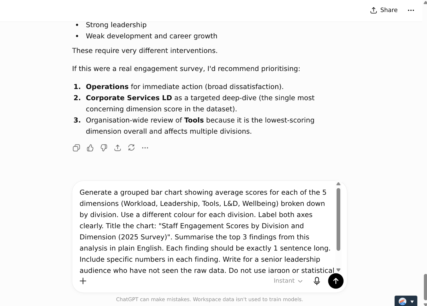
Paste in the next prompt
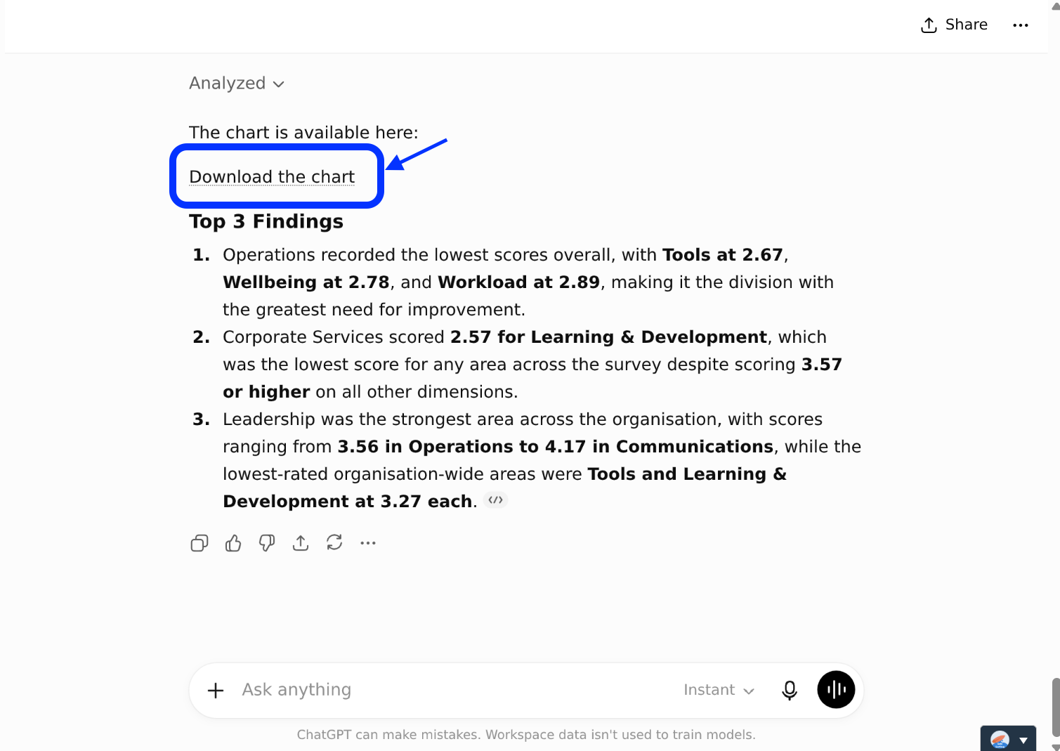
Click on 'download the chart'
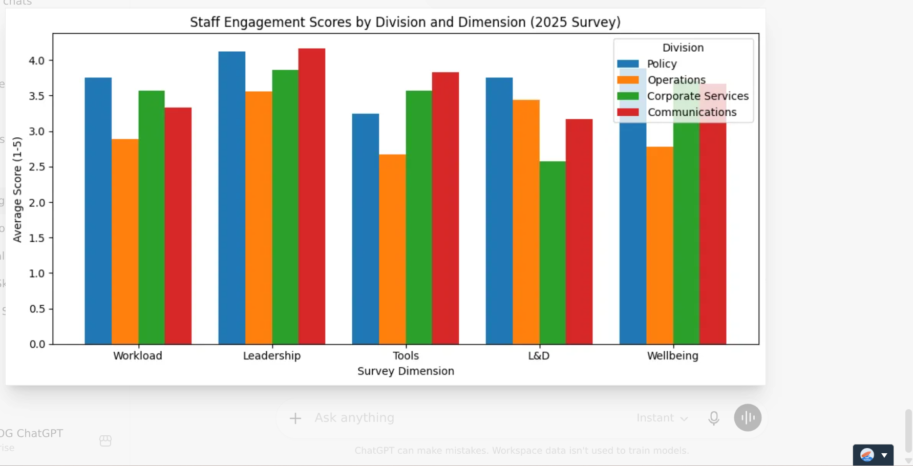
Always check AI’s output
Use this prompt if the first chart looks cramped or hard to read:
Refine the chart for a leadership slide:
Set the y-axis from 1 to 5 (the full rating scale) so the differences are shown honestly.
Add a data label on top of each bar showing the value to 1 decimal place.
Use a clean, colour-blind-friendly palette, with a clear legend and readable font sizes.
Give it a descriptive title and clearly labelled axes ("Division" / "Average score, 1–5").
Order the divisions from highest to lowest overall average, and lightly highlight the lowest-scoring division.
No overlapping bars or labels.
The legend must not overlap the chart area.
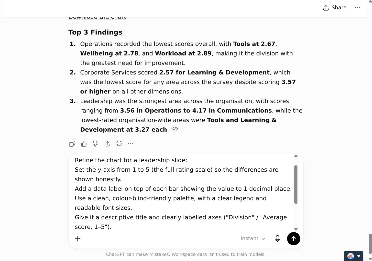
Enter prompt to refine chart
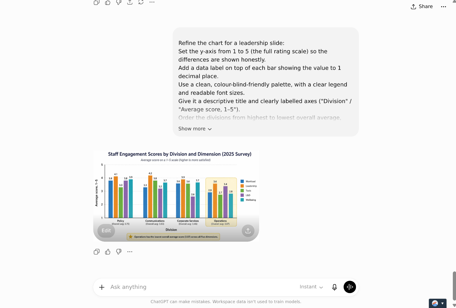
Click on the updated chart to view it
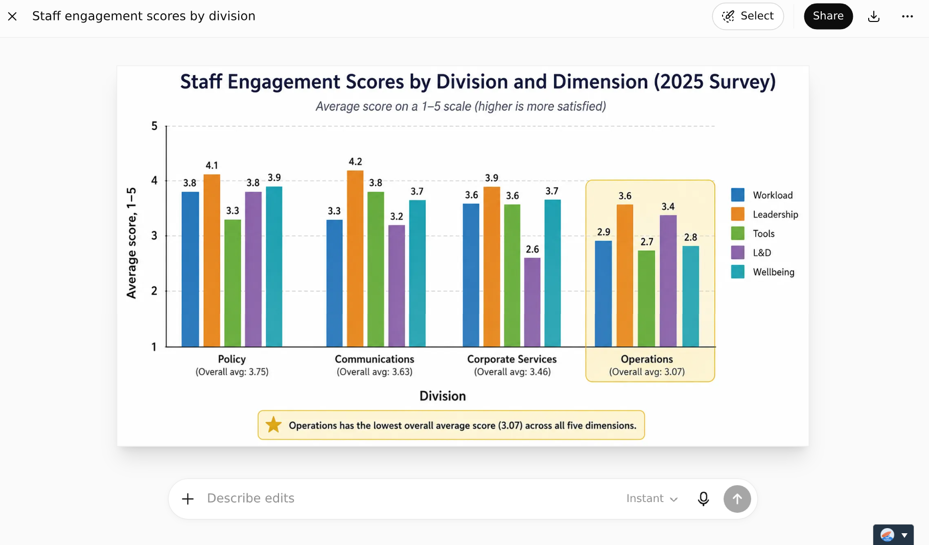
Always check AI's output, even if you have to check again and again
Step 7: Save as a Skill. Save the workflow so the next survey cycle is a single upload:
Use this sample prompt
Package this process into a reusable Skill called 'Survey Insights (F.I.T.)'. Next cycle, I will upload a new CSV and want you to Frame, Interrogate, and Tell using this same approach.
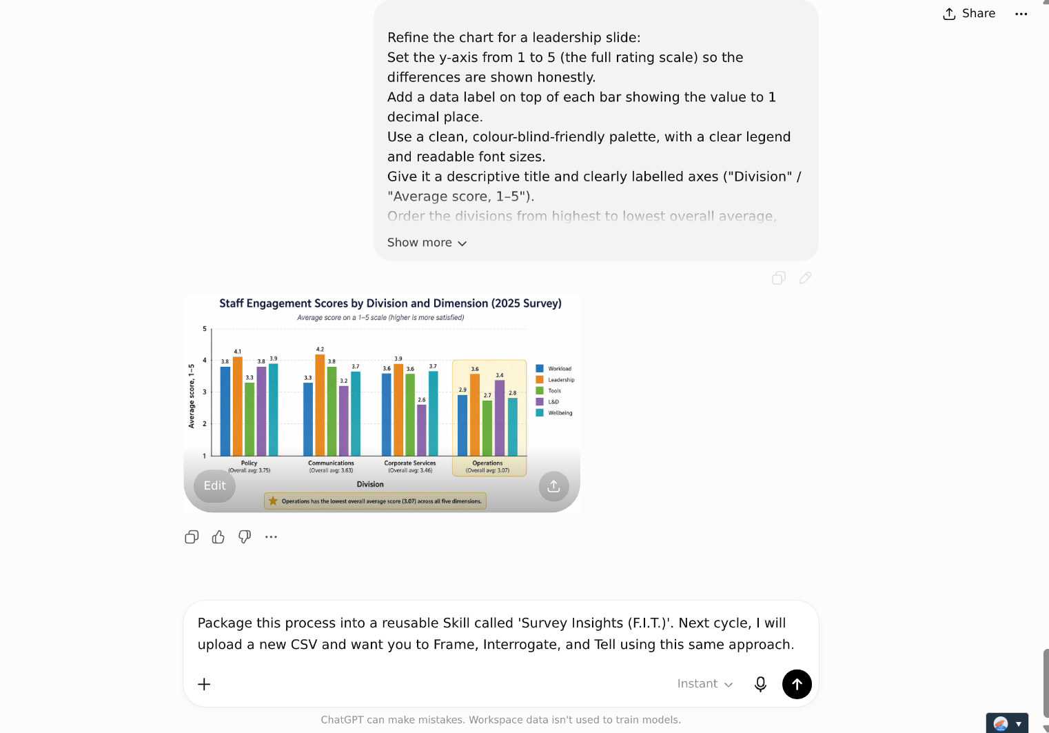
Enter sample prompt
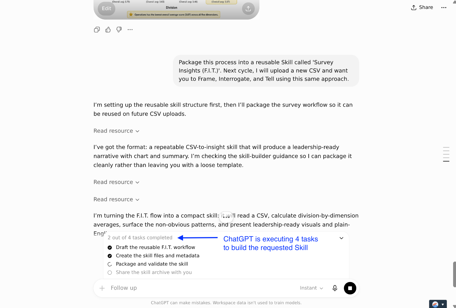
Send the prompt and watch ChatGPT get to work
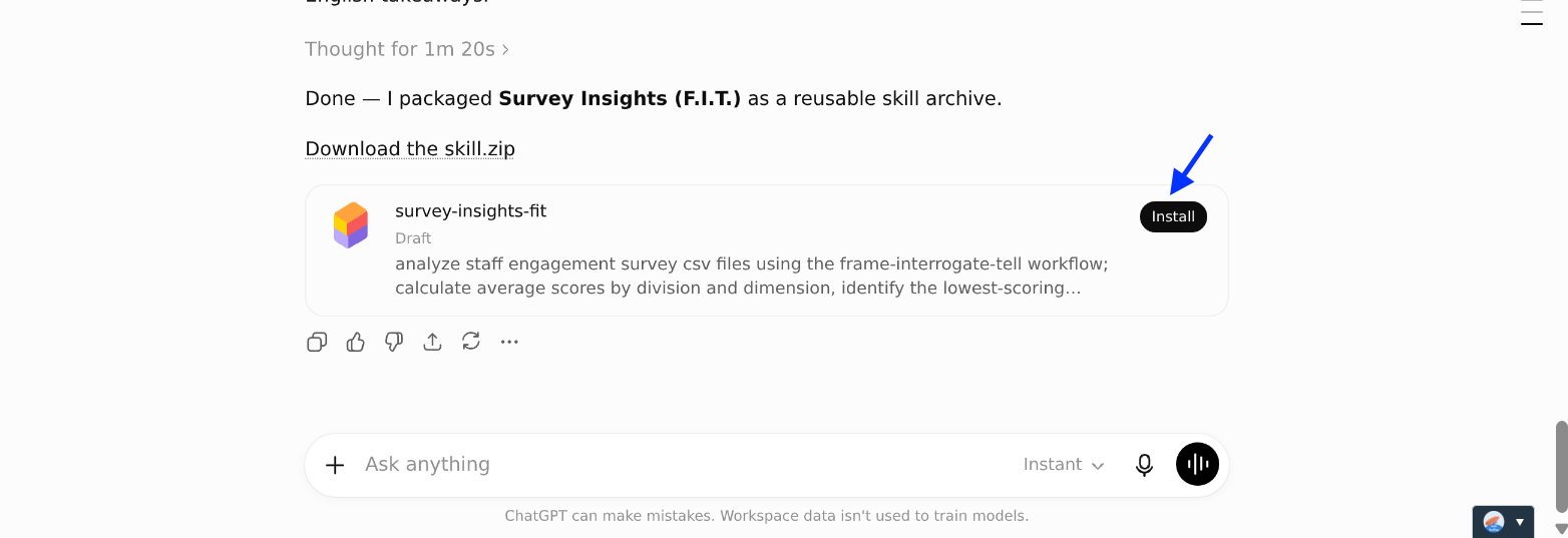
Install the Skill

And try it out
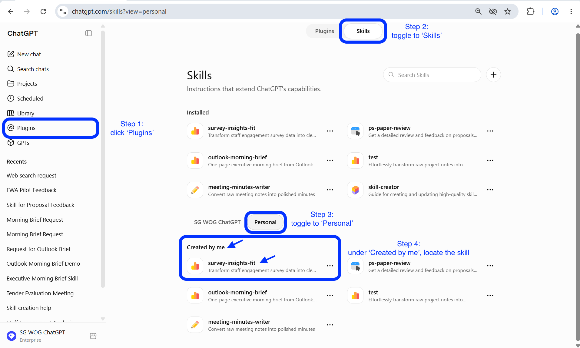
If you don’t want to try out your newly created Skill today, that is also okay. You access the same skill on the Skills Page. The Skills Page is located under: 'Plugins' > 'Skills'. Once on the Skills Page, locate the skill. It should be under 'Created by me'. If you can't find it there, check above under 'Installed'.
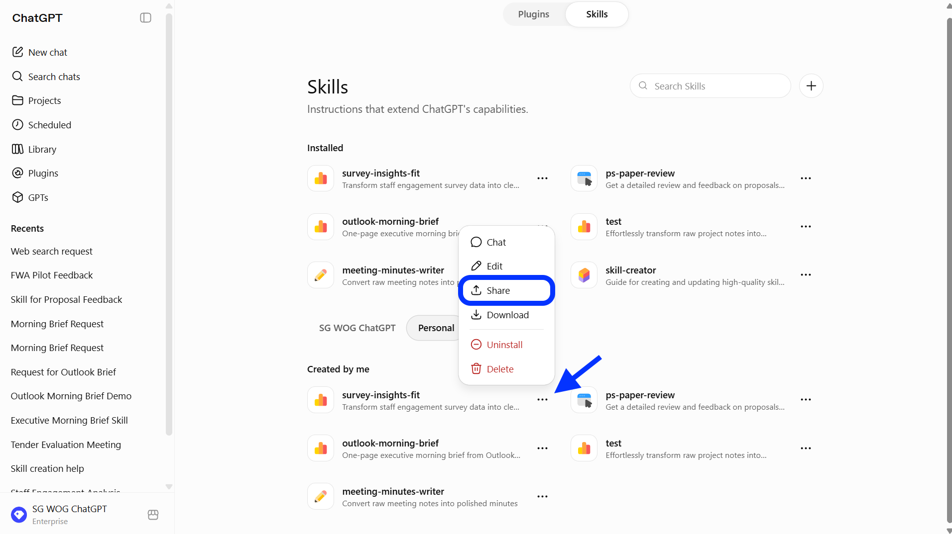
Once you have found the skill, click on "..." to share.
Now it's your turn to try!
Take 10 minutes for data analysis and creating impactful visuals.
📂 Prepare your data. Get the survey results ready in the right format and have ChatGPT generate a visually impactful chart/figure for you, highlighting key findings.
⚡ Review Critically. Ensure that the AI returned insights that are useful, or iterate further to obtain meaningful conclusions.
🔍 Test and Share. If this worked well for you, consider saving the workflow as a skill and share it with others.
There you have it, data analysis with accompanying visuals in a matter of minutes.
📅Following the 12-Week Learning Plan?
Congratulations on reaching Week 8! This guide is part of a 12-week learning plan designed to help you build practical AI skills. You're well on your way to becoming AI fluent.

Preview the 12-Week Learning Plan
12 Week Learning Plan
⏭️Next Guide: Draft Job Descriptions [HR]
↩️Return to: AI 201 Apply Learning Pathway